dG Framework
A downloadable font
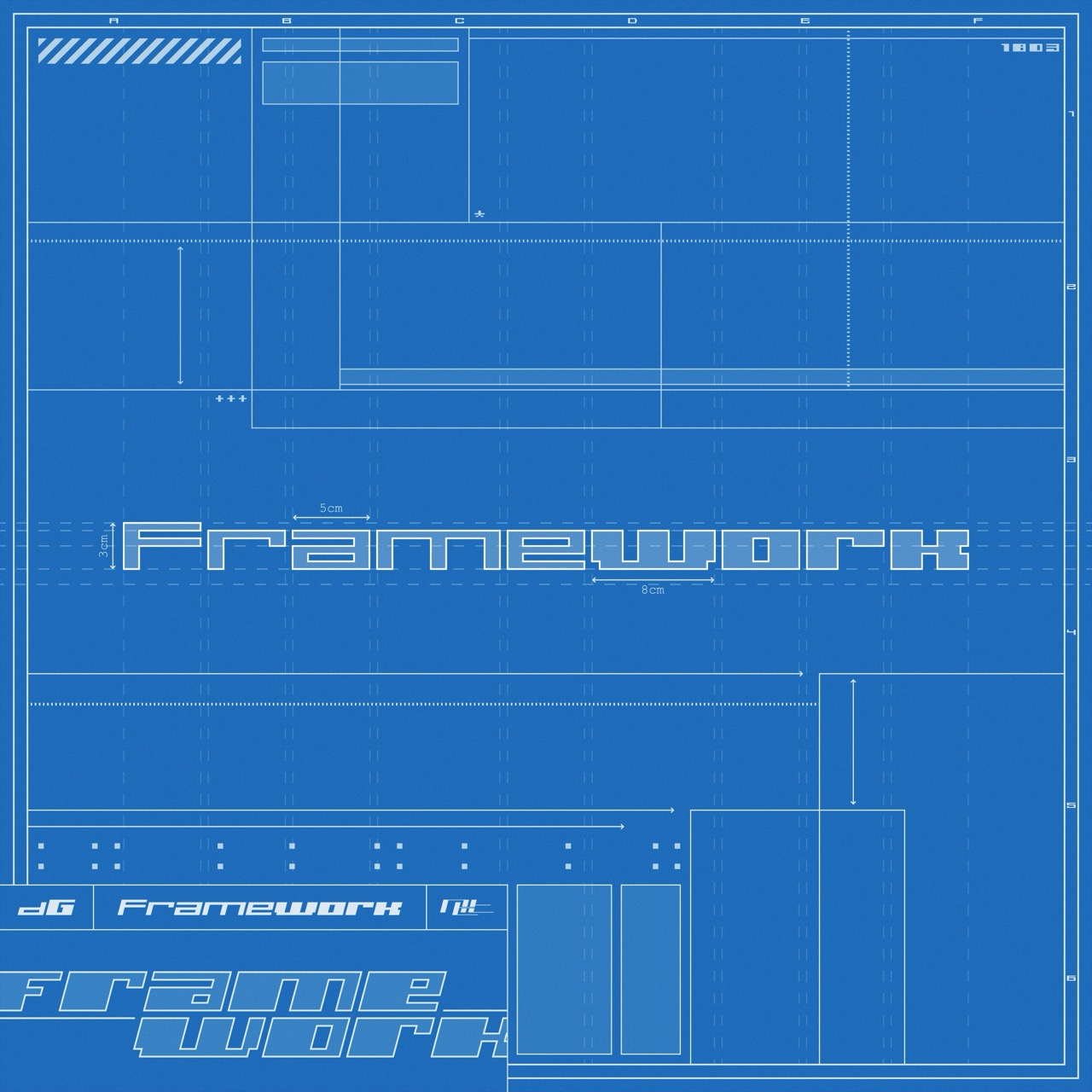
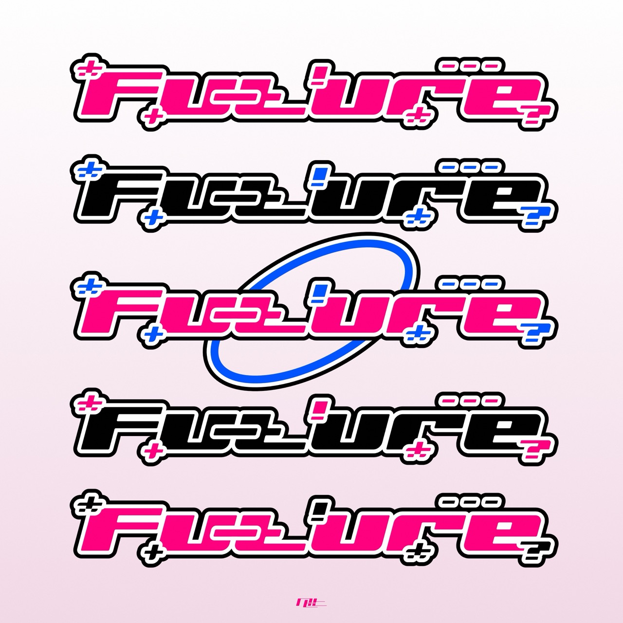
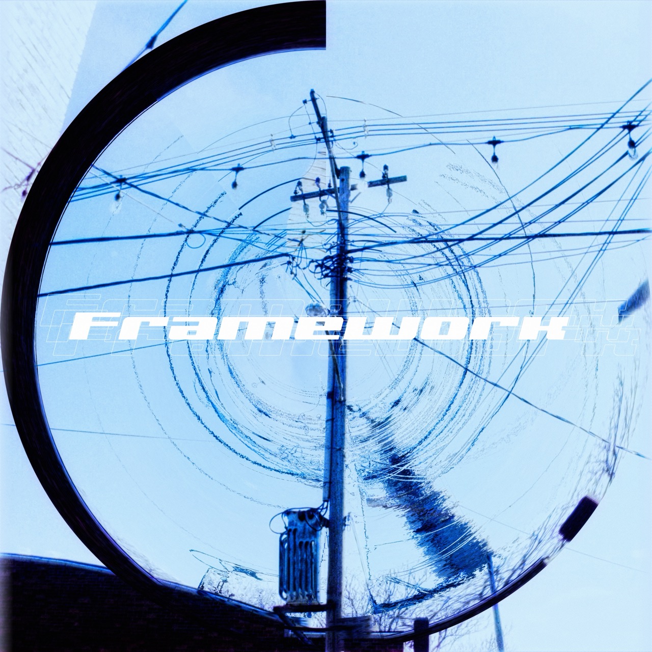
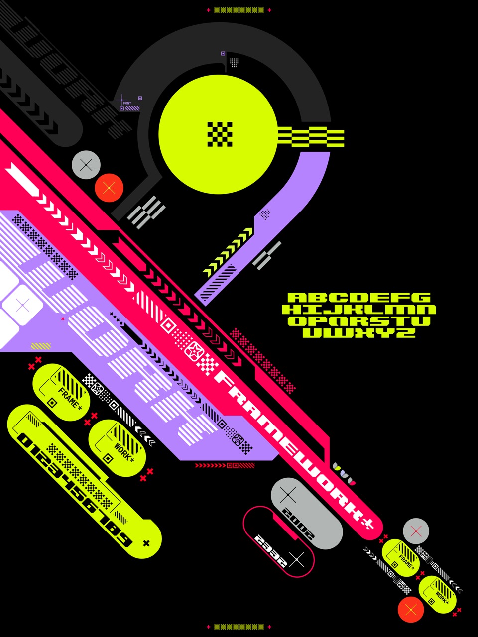
A font family from dG & ntt.
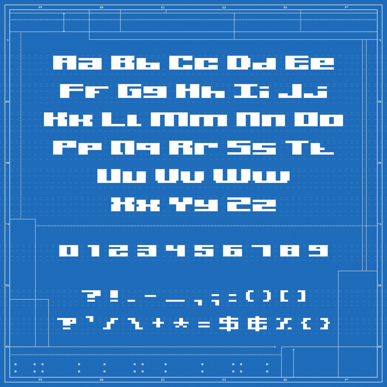
dG Framework features 24 different font variations, giving you the opportunity to tailor it for use in a variety of places and projects.
This purchase is provided as a license for both personal and commercial use. If you own dG Framework, you can use it on/in your game/movie/website/artwork. No questions asked, aside from "hey, where'd you get the cool font?".
Purchase
In order to download this font you must purchase it at or above the minimum price of $15 USD. You will get access to the following files:
Development log
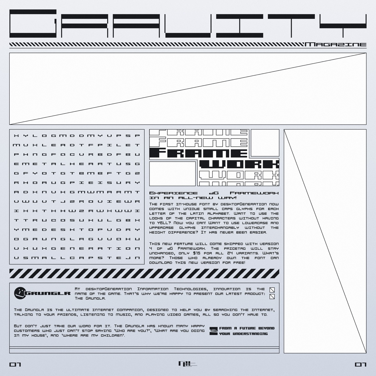
- dG Framework-v4Apr 29, 2025
- dG Framework-v3Apr 16, 2025
- dG Framework-v2Apr 11, 2025
Comments
Log in with itch.io to leave a comment.
The font looks beautiful and I am happy to support it, however, it appears to me at least that every type of the font I've installed has very, very low kerning, to the point most letters will intersect each other, I don't know if this is intended given the shots on this page don't appear to have the same thing going.
Thank you for letting us know! The kerning is supposed to look like it does in the showcase artworks, so this is definitely not intended. I'll look into this issue as soon as I can!
Could you tell us what software and operating system you're using? Have you tried the font in other software to see if that makes a difference?
If you could provide a screenshot of what the kerning looks like to you, that would also be a great help. Thanks again!
I've found out that it had to do with the fact I'm using a feature of OpenType that's apparently not widely supported yet. Still, to account for as many apps as possible, I'm making adjustments. A new version of the font should be available very soon. Thanks again for the heads-up!